A custom new interface for a renowned sports brand
Bell Media TSN Go on iOS and Android
S P O R T S / I O S / A N D R O I D
Led the creation of information architecture, wireframes, user flows, user journey maps, UI, prototypes in the end-to-end design process delivering high-quality applications with 4+ star ratings
Designed and delivered live video streaming component resulting in 90% CSAT boost and 70% ad revenue growth
I led a comprehensive redesign of the Bell Media TSN app for iOS and Android, aiming to modernize and streamline the previously outdated design inherited from Digiflare/Accedo. This project focused on evaluating and enhancing the app's visual presentation, incorporating new typography, a refreshed visual style, updated primary and accent colours, among other elements, to achieve a contemporary and user-friendly interface. The redesign was strategically aimed at not only improving the aesthetic appeal but also enhancing the overall user experience, ensuring a more engaging and intuitive interaction for users.
Discovery
I've conducted a detailed investigation of the old app and led the development of initial concepts for the pre-sales discovery pitch. Additionally, we conducted informal interviews with sports-oriented colleagues and friends to gain insights into core user personas.
Objectives
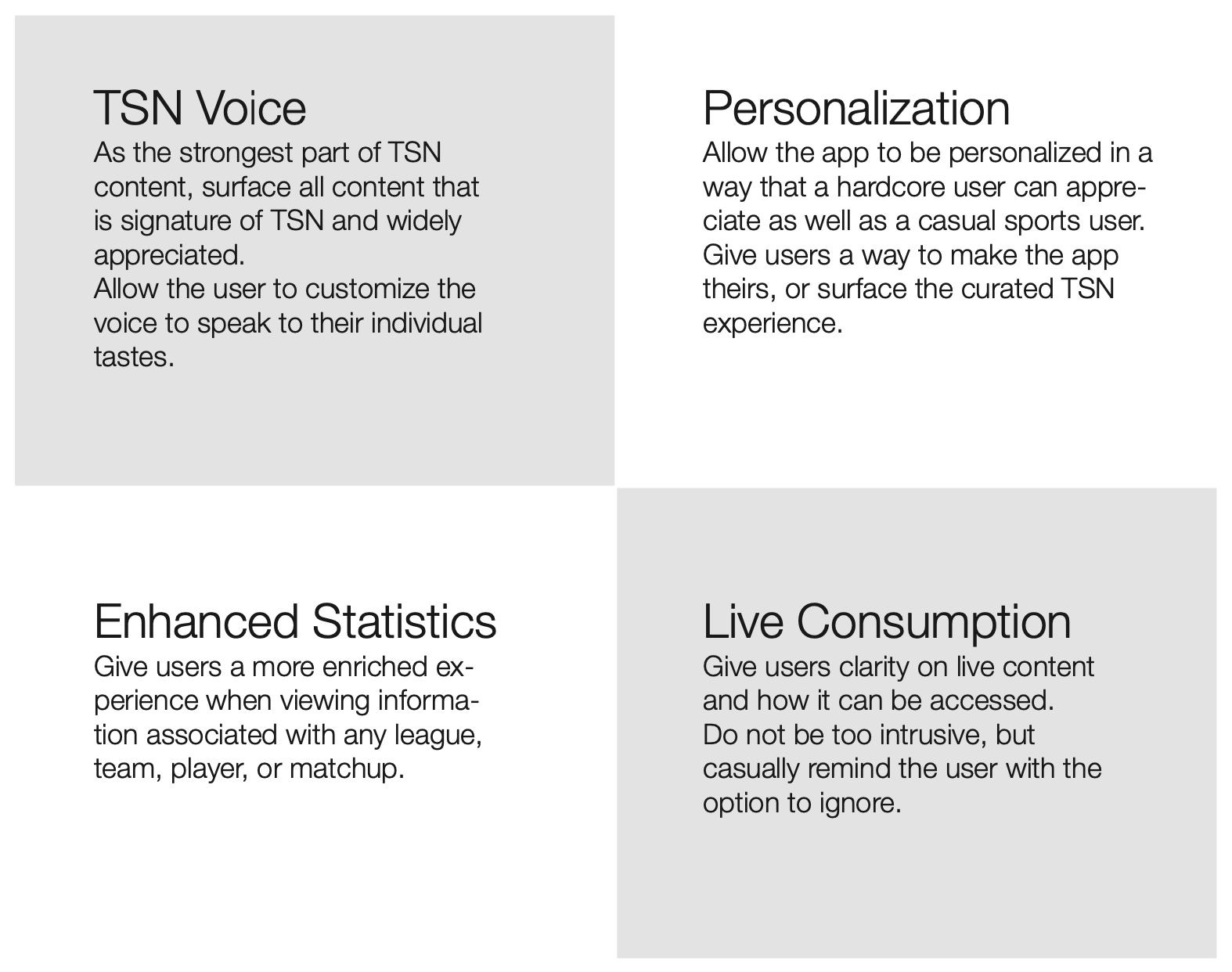
I led the team through multiple workshops with the account managers and sales associates where we outlined four core objectives that would be used as a foundation for the rework. We also spent some time scraping through reviews on the in-market app to identify areas where multiple complaints were being made.
Concept exploration
A couple of concepts were whiteboarded and wireframed for the discovery. My team and I intended for these to be exploratory and visionary, using completely new paradigms based on the personas and aiming for the goals collected. We pared it down to two concepts with very different directions.
Concept 1
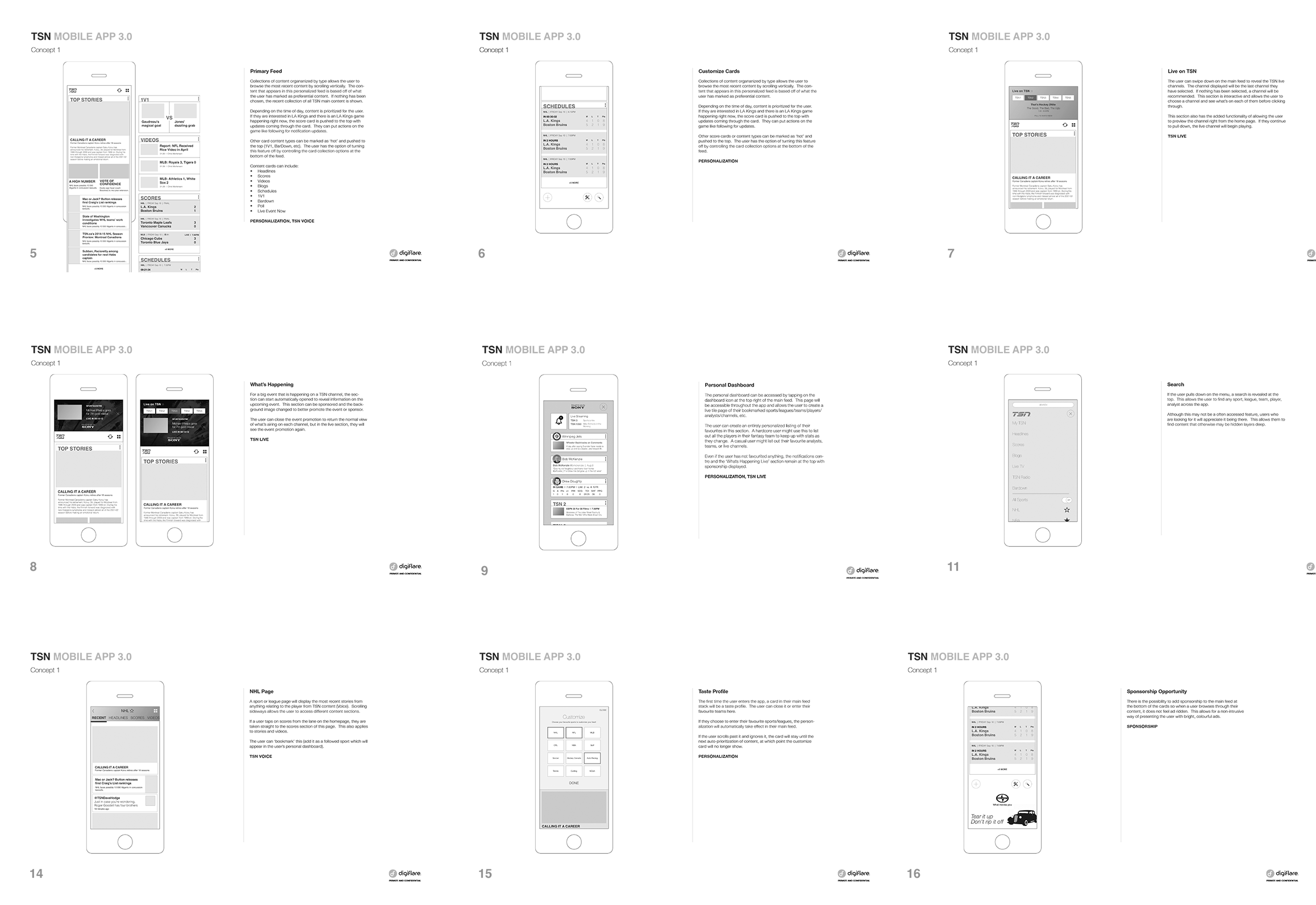
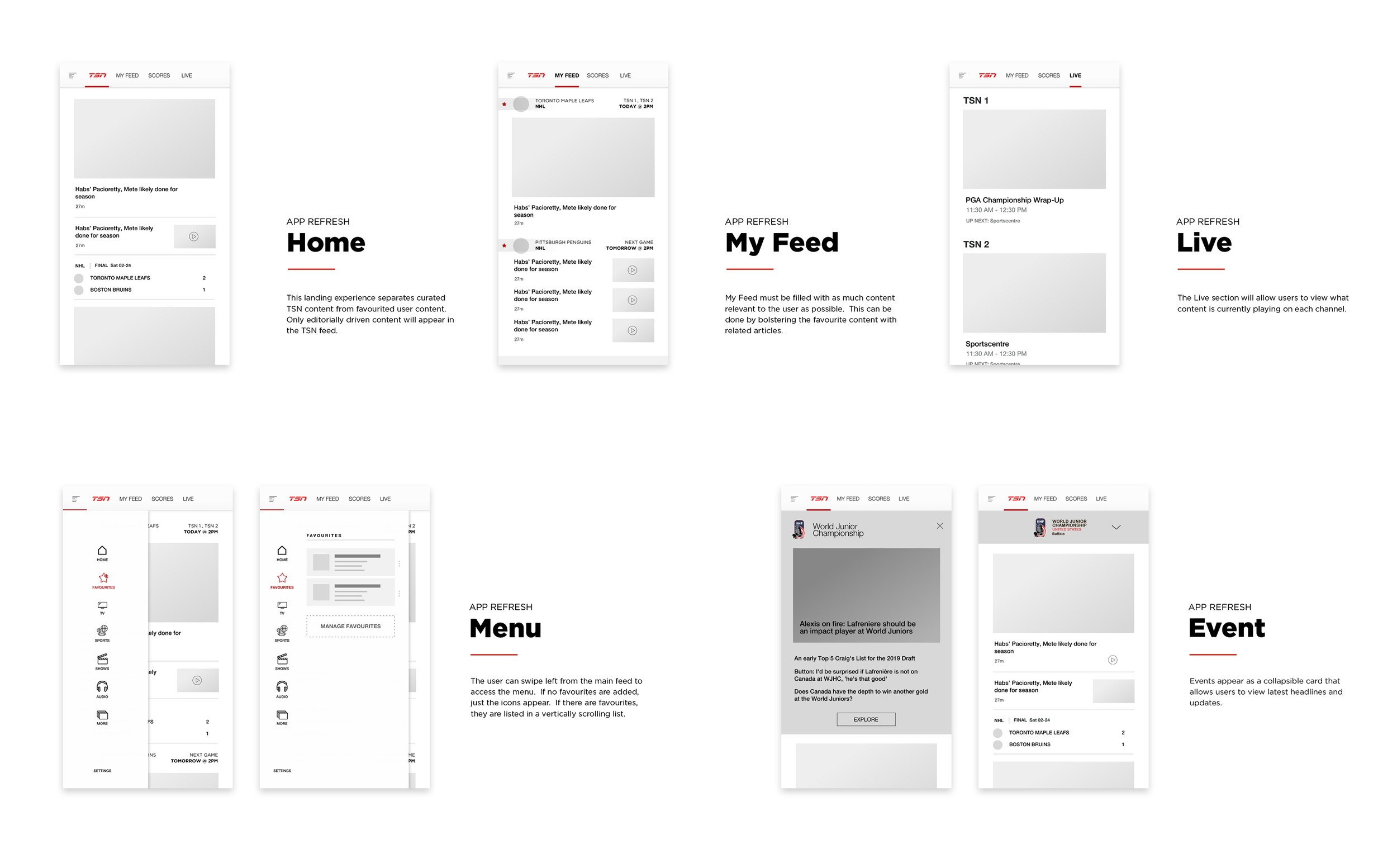
This first concept addressed one of the biggest areas of improvement – the landing experience. The client felt it necessary to re-evaluate the existing landing page experience as it immediately directed the user to recent scores every time, without showing any news. In this concept, when the user opens the app, they will be greeted with information organized into cards that may shift depending on the time of day. During the morning, articles and headlines about recent games would be surfaced first, followed by scores, and other Al driven prioritization. This would also allow the client to input sponsorship, or new features, podcasts, and other highlights.
Concept 2
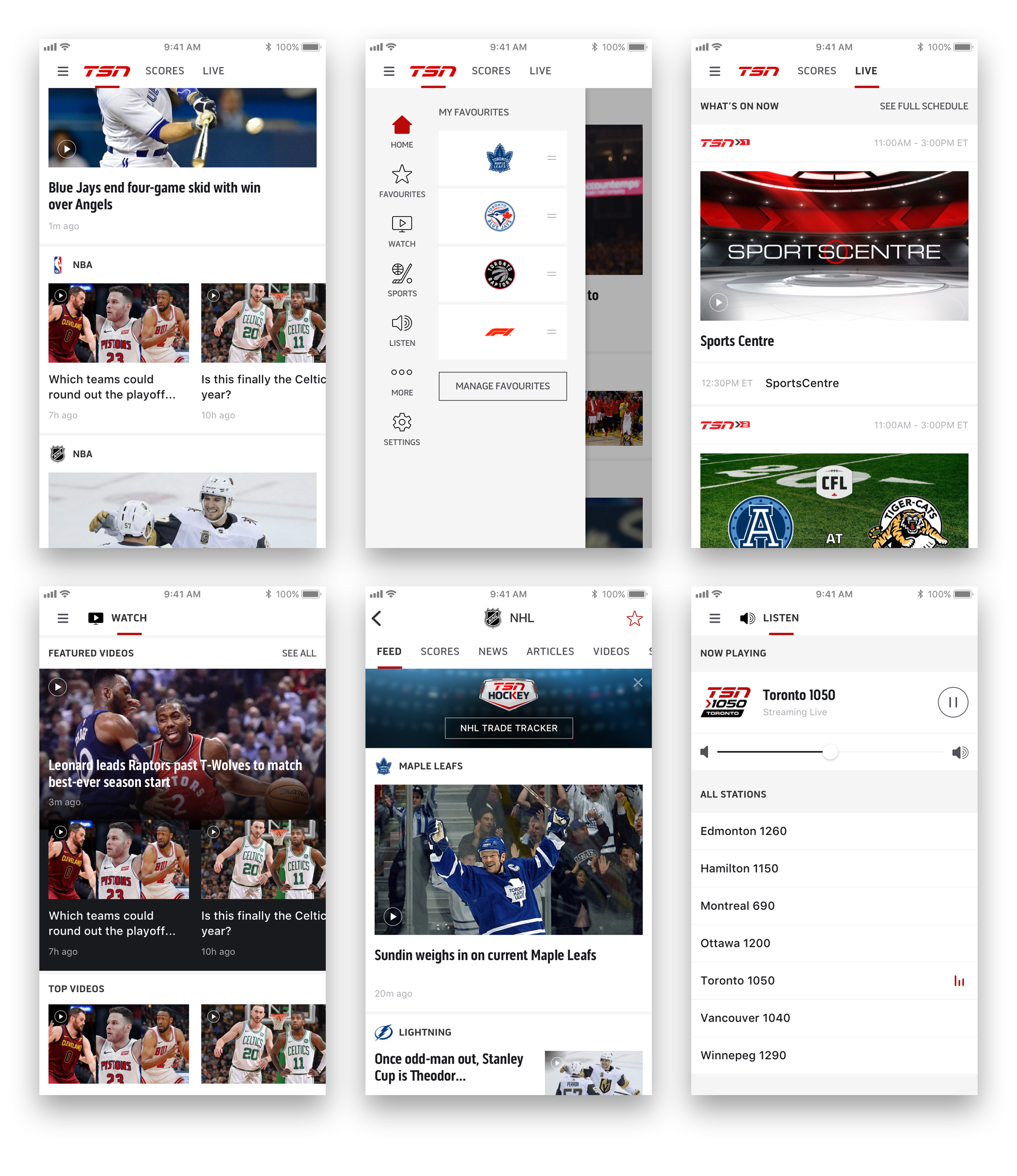
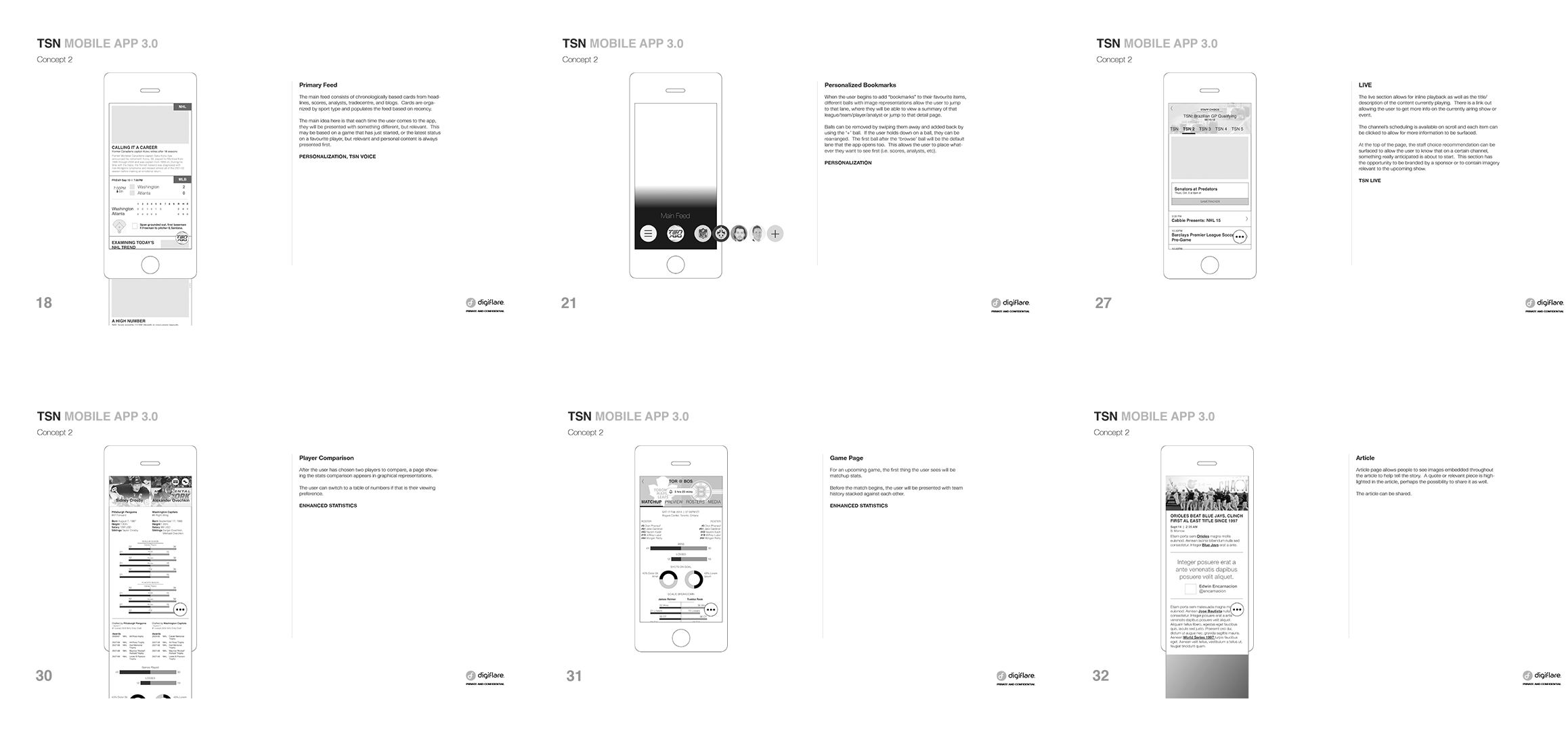
The second concept had the idea of a floating, customizable menu. This menu would allow users to favourite teams, leagues, analysts, players, etc., essentially building their own app. The menu would begin with a core set of immovable items (headlines, scores, videos, live), but the user can choose to rearrange or add to them. This was one of the existing issues highlighted by the client team. They felt that users did not immediately recognize that the menu was part of the logo, and that it was too heavy and cumbersome.
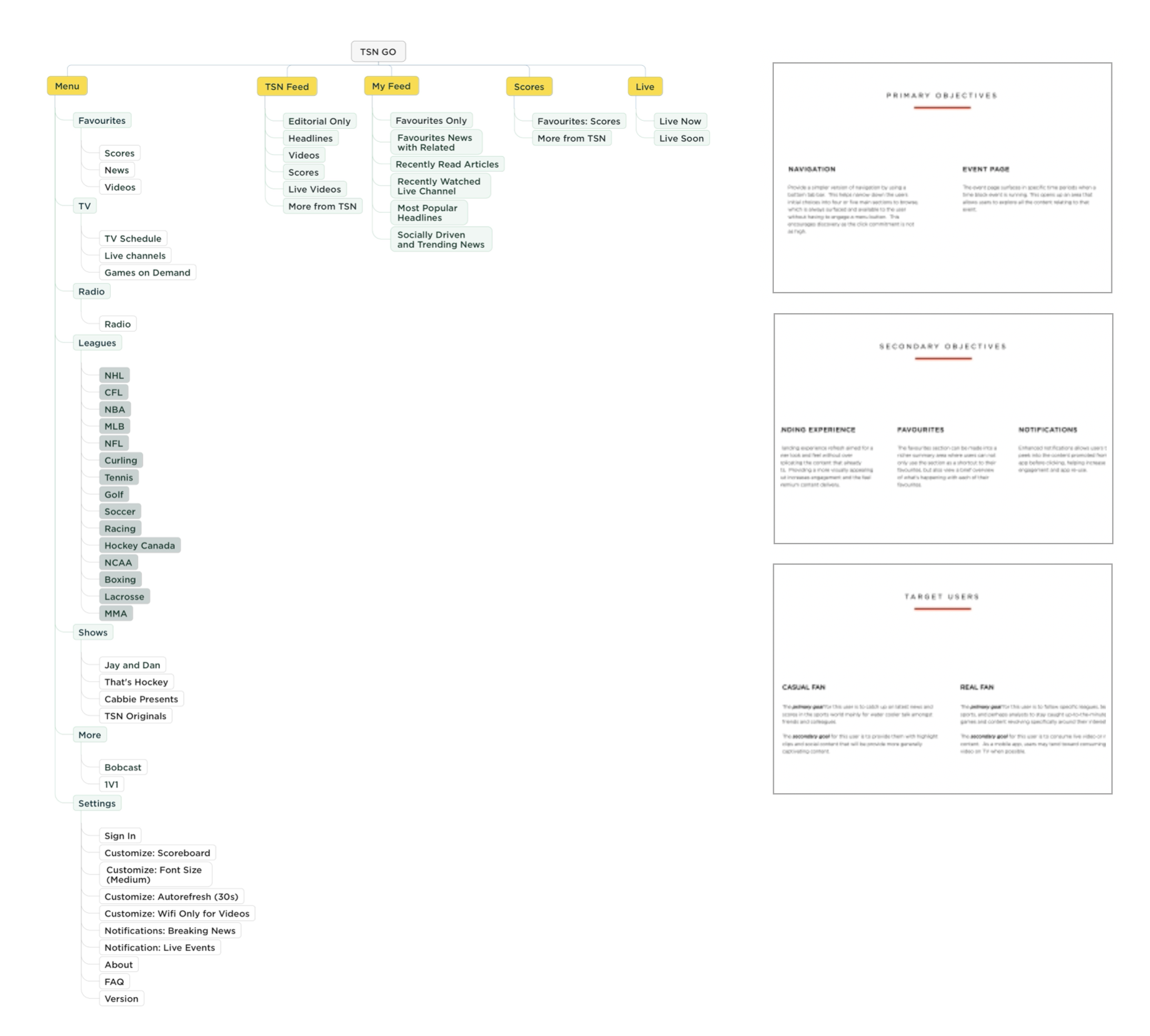
Information architecture
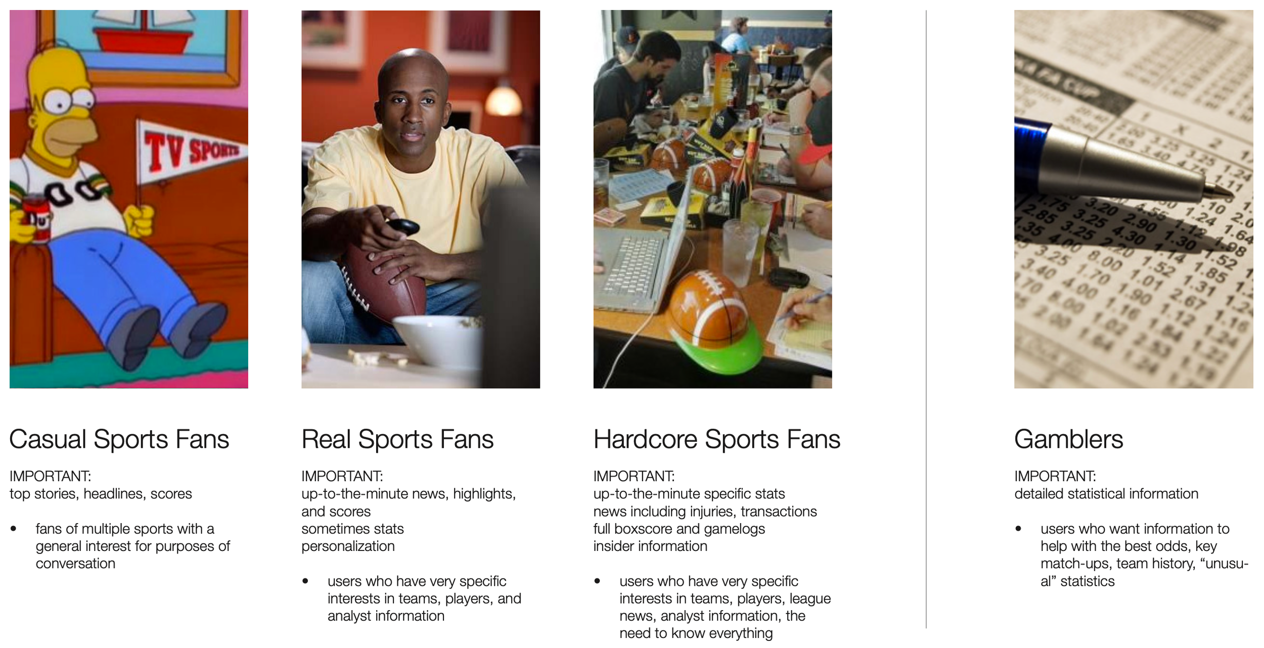
The client narrowed down two primary objectives from the discovery process. They wanted to focus mainly on updating the navigation to something much more clean, modern, and intuitive. The other primary objective would be for the event section. As the World Cup was coming up, the client wanted to be able to add in the event section to the existing app first, then incorporate it into the updated app later. Secondary objectives to keep in mind were key targets that the client highlighted as problem areas. The array of personas was also cut down to focus on two main ones that they saw as most relevant for their app: the casual fan and the real fan.
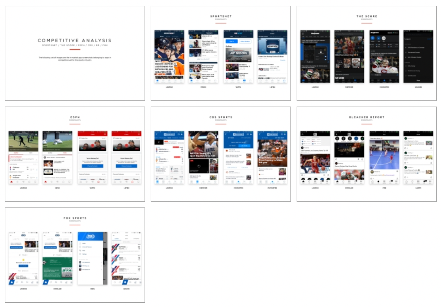
Competitive analysis
A competitive assessment was also done to review with the client stakeholders how they felt about competing features and aesthetic that their users would face. We discussed the star ratings, highlighted positive and negative feedback, and our own feedback on the apps.
Wireframing
The wireframing process began with a site map to identify the current structure of the app and call out areas that could be moved or improved. From the site map alone, it was apparent that content was buried deep.
We began with concepts for both the overall app direction as well as the additional event section. One big change was to consider other navigation models, a vertical hamburger menu or a tab menu bar at the bottom.
The tab bar menu allows for easy access to a handful of key areas. This works well if the Al powering personalization is very good, in which case the user does not need to dig around to find content.
The hamburger menu allows for more screen real estate to be dedicated to content. Incorporating it with the main areas of navigation on the home page also serves to give more screen to content. The vertical navigation would allow for the user to feel more control when looking to see what the app has to offer.
Visuals
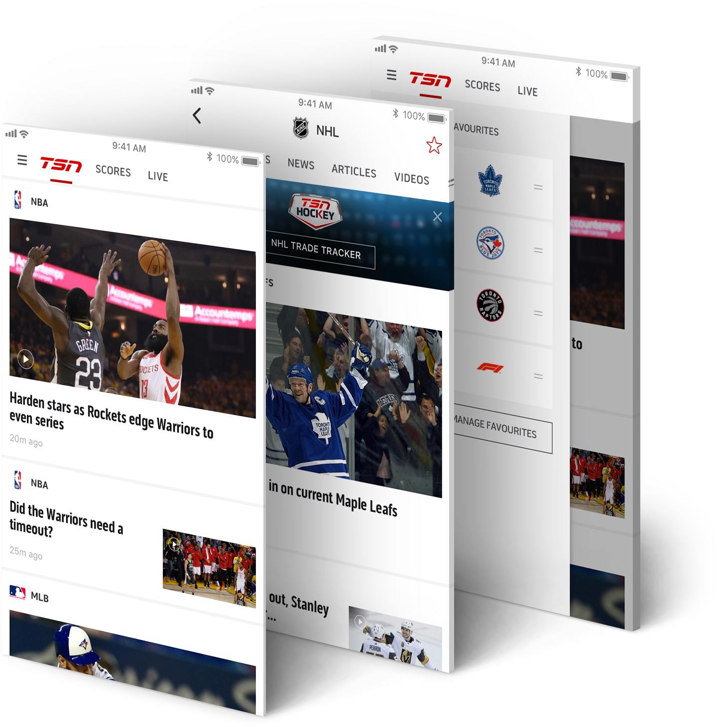
The visual design direction was re-imagined into a clean white look that would contrast greatly from the previously heavy design. The white would help make the TSN branding colour stand out more and make the thumbnails stand out against the clean background.
To accommodate for both users who add favourites and those who don't care for it, the menu bar would expand to show favourites allowing quick access to key elements. A preview of each favourite would give the user a snapshot update of their teams/players/analysts/etc.